orbro — Building the orbro Design System
I led a project to define the design concepts and build the design patterns and system for orbro, a location-based digital twin platform. This design system is still being continuously refined and helps improve communication among designers, developers, and all team members involved in the product.

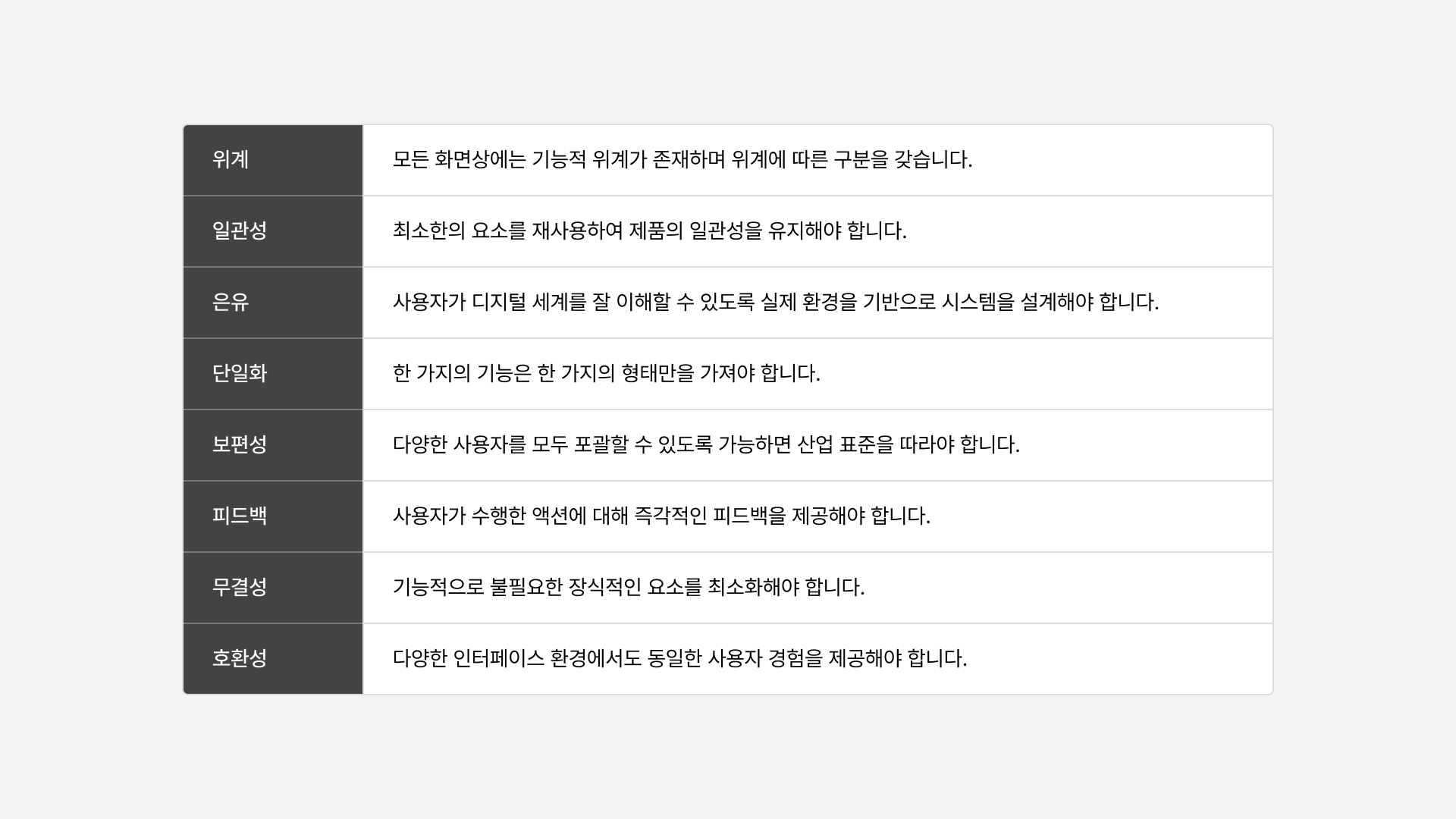
Design Principles as System Standards
Before building the design system, we understood orbro's service environment and defined design principles that could address it. These principles served as the basis for decision-making during the design system construction and helped establish orbro's unique design philosophy.

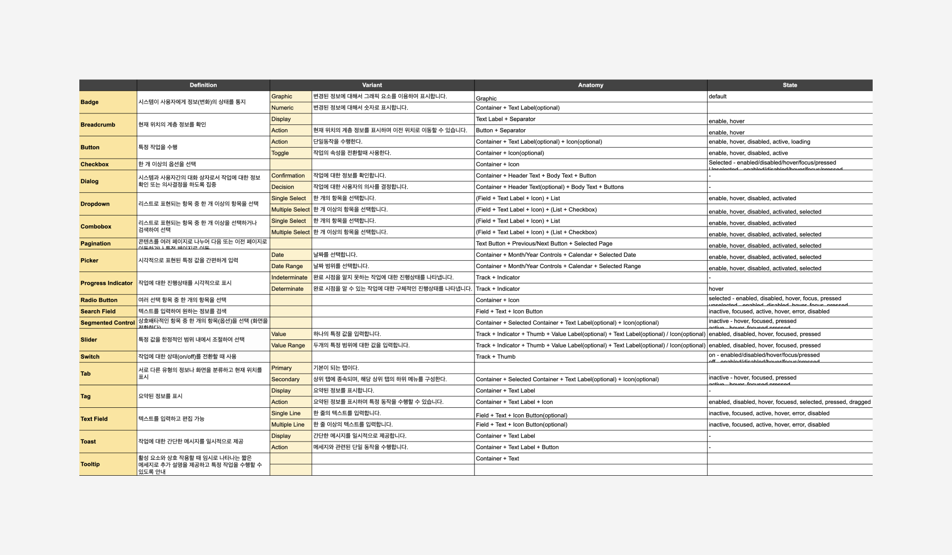
Functional Definition of Components
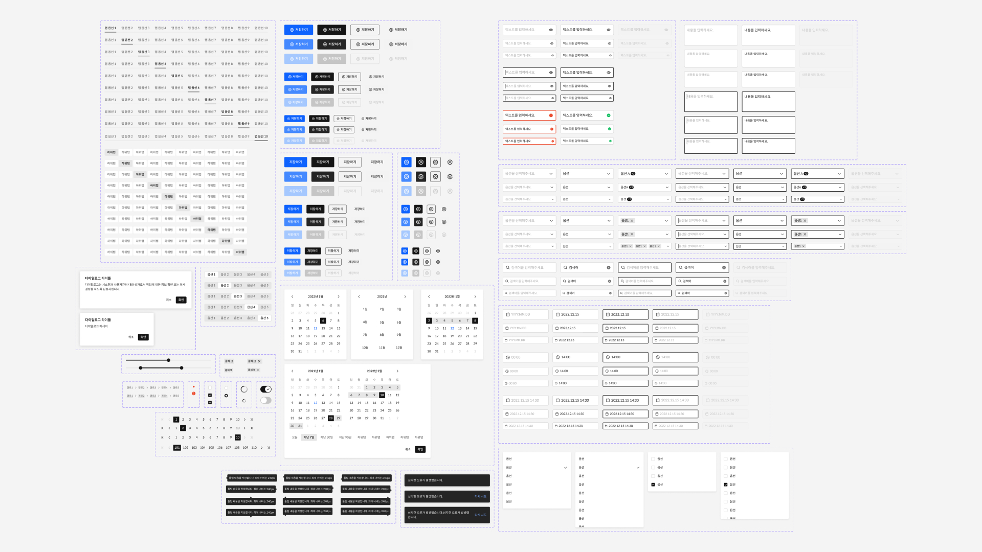
We selected frequently reused design components from the current service and redefined their functions. We also analyzed and documented each component by its variants, anatomy, and states.

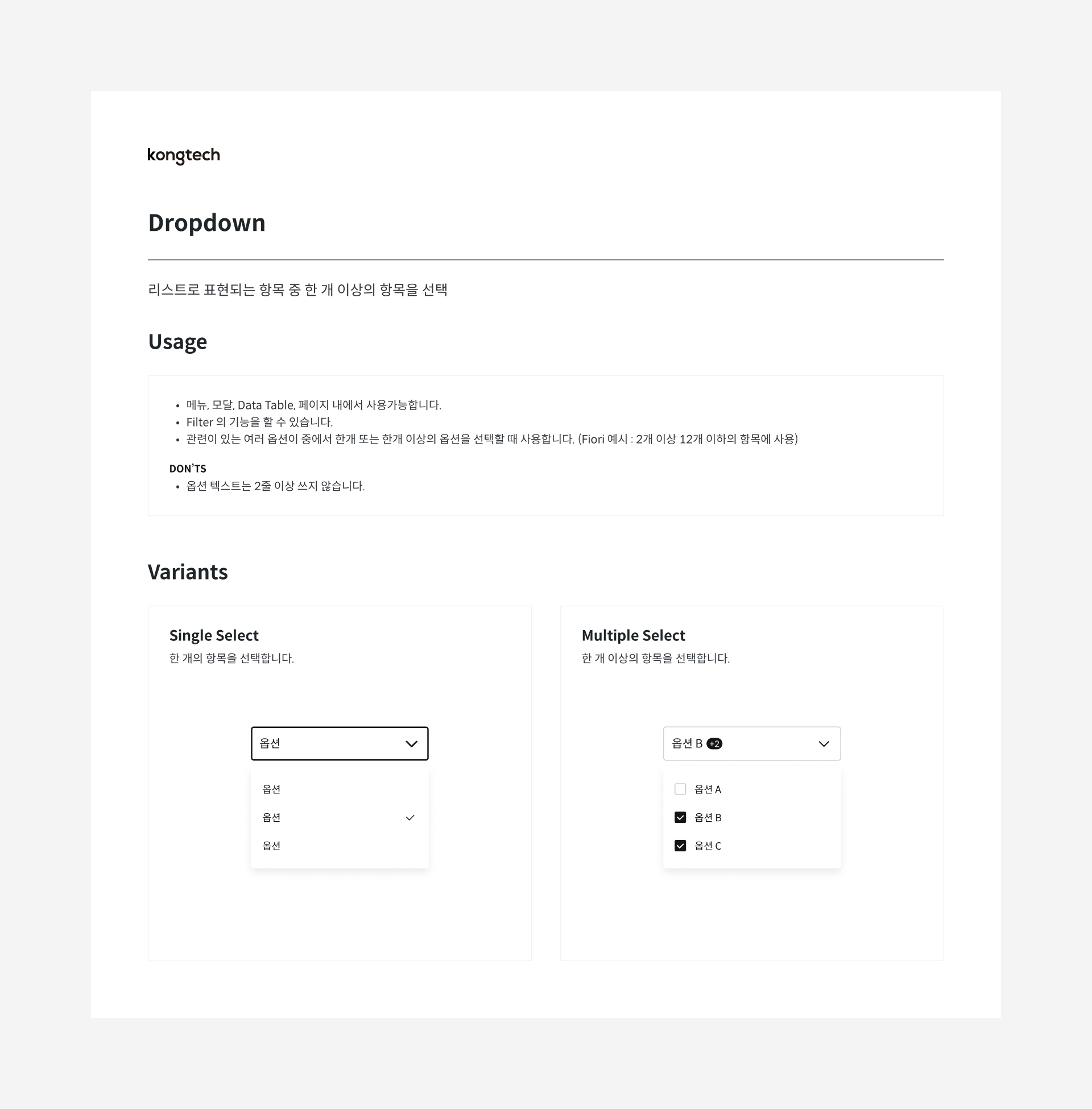
Component UX Guidelines
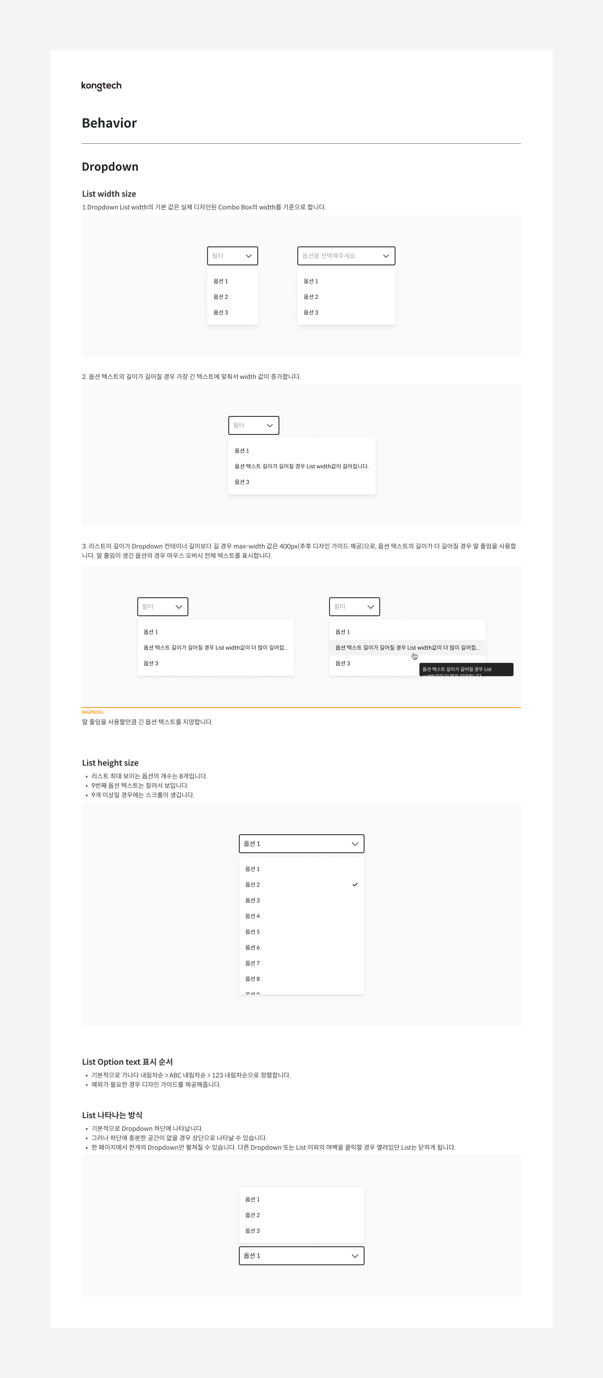
Previously, the same component was used for different functions, or different components were used in the same situation, compromising service consistency. To address this, we clearly defined the functional purpose, variants, usage notes, and UX guidelines for each component and documented them.

Component Usage, Variants

Component Behavior
Component UI Guidelines
With multiple designers working on the same components, there were inconsistencies in their appearance and design across different scenarios. This affected both service consistency and development efficiency. To solve this, we defined the interface elements and appearance of each component and documented the visual representation for different scenarios.

Component Anatomy, States, Specs
Typography Optimized for Data
orbro's old font system used 'Noto Sans CJK KR' for web and Android and 'Apple SD Gothic Neo' for iOS. This required double work and constant adjustment for layout changes caused by slight font differences, lowering team productivity. To resolve this, we decided to use a unified font.

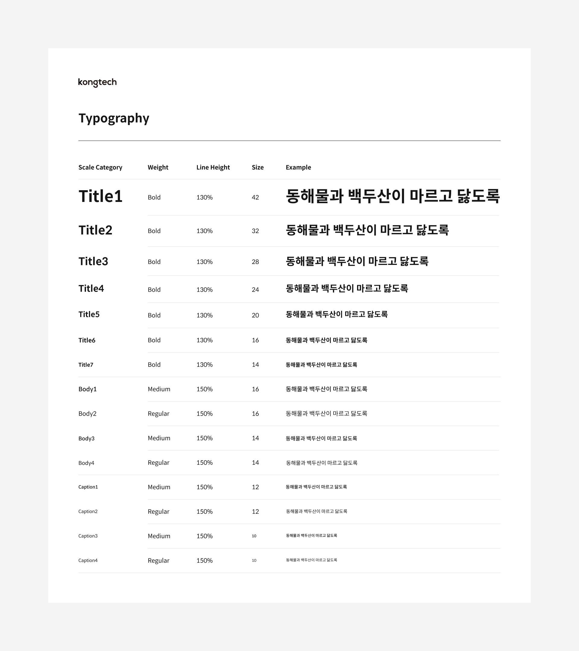
Typography Organization
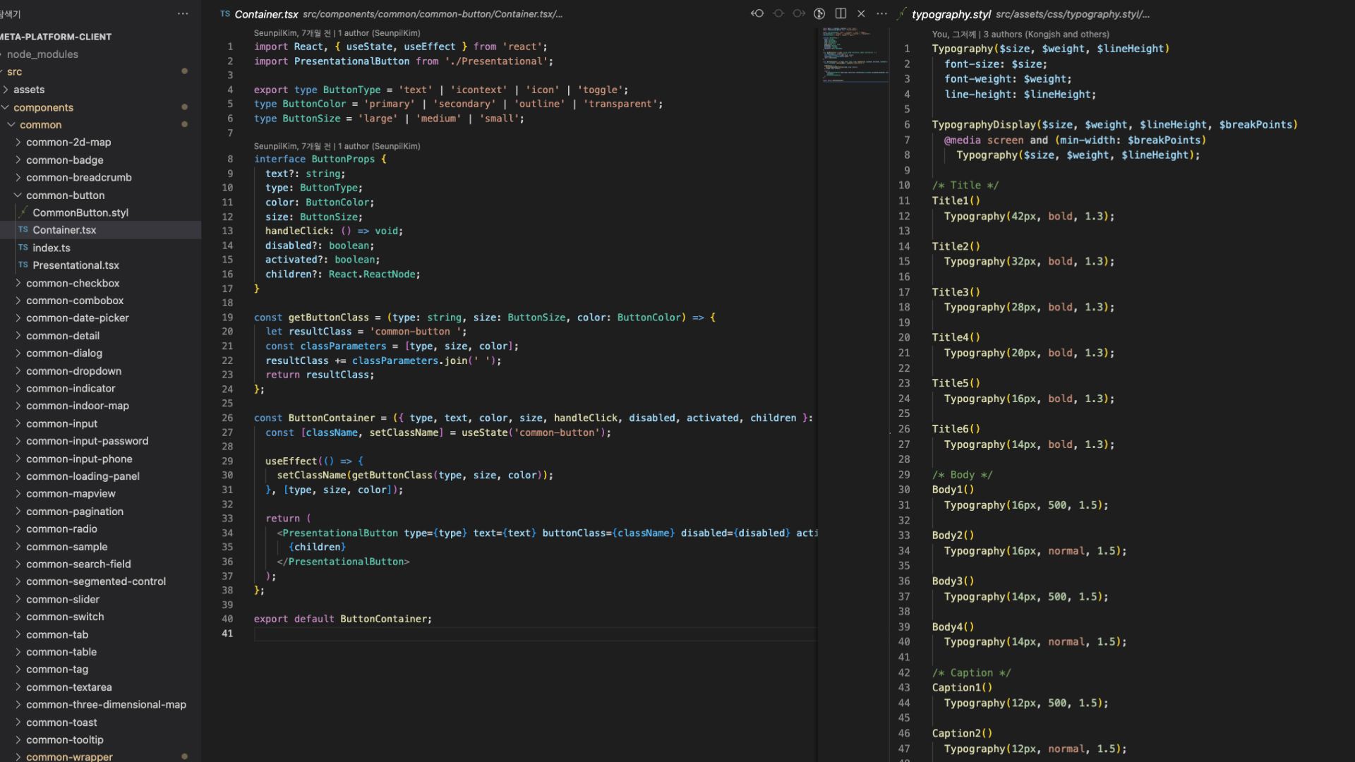
orbro's new font system adopted 'Spoqa Han Sans Neo,' which is free for commercial use and provides consistent usability across web and mobile (iOS/Android) environments. It also offers better readability for the numerous numbers used in our service. Typography was categorized into 'Title,' 'Body,' and 'Caption' based on their usage, and each category was documented by size and weight.
Color System and Semantic Color Tokens
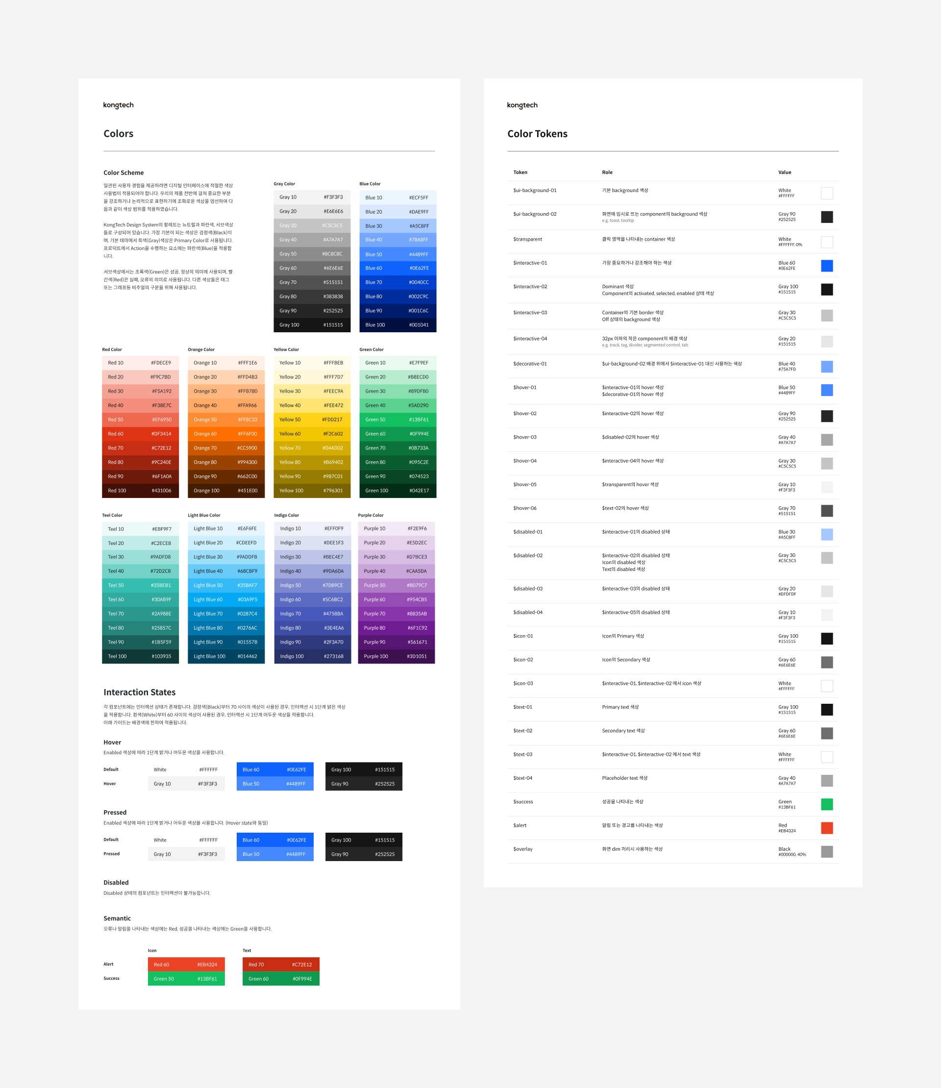
We defined the main colors used in the system (Gray and Blue) and secondary colors (Red, Orange, Yellow, Green, Teal, Light Blue, Indigo, Purple) by brightness and organized them into a color palette. Frequently used colors were selected and documented as semantic color tokens along with their usage purposes.

Icons Representing the Brand
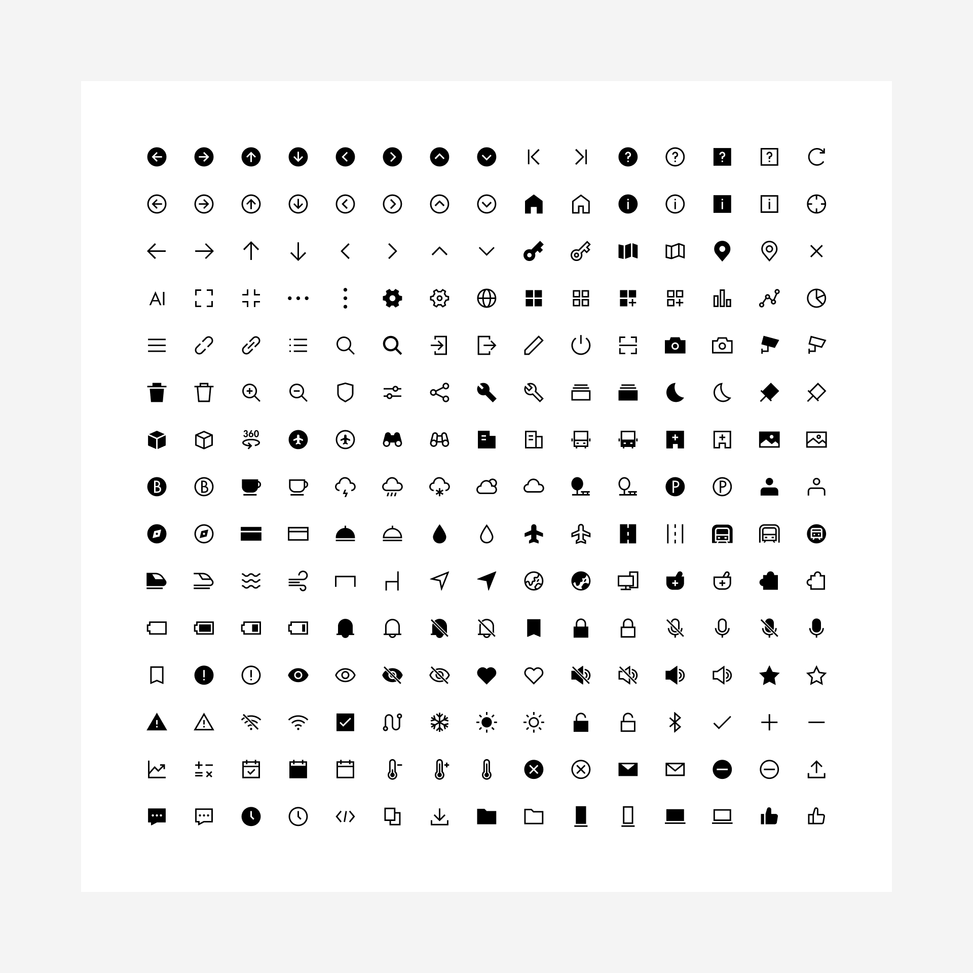
Collaborating with the BX designer, we created icons that consider the overall branding of the service. Icons were categorized into Arrow, UI, Object, Status, and System, designed to be simple yet expressive of the brand concept based on the previously defined design principles.

Responsive Layouts Considering Data Types
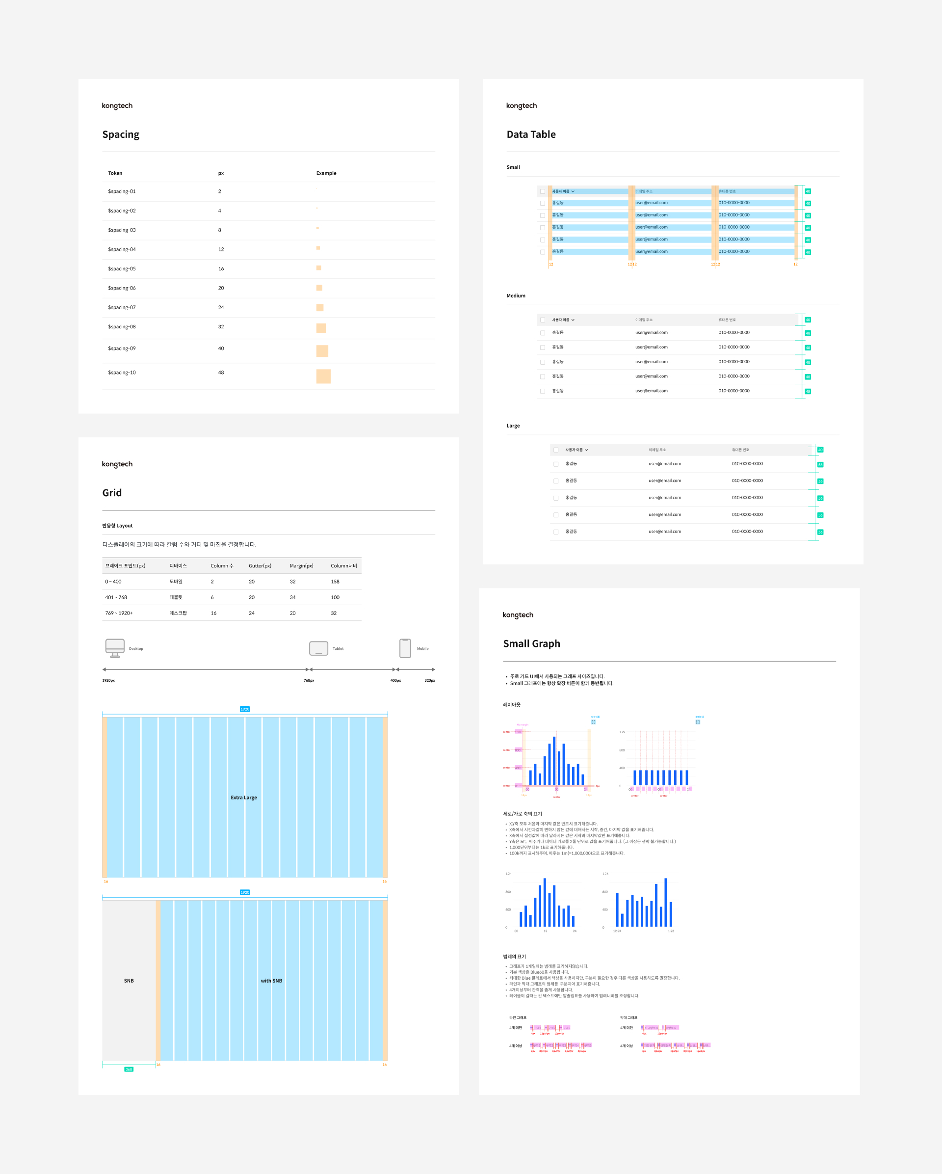
To ensure consistent design, we established a 4px grid system and a 16-column layout grid. This layout accommodates responsive design for resizing browser windows and provides guidelines for data tables and graph layouts.

System Assetization for Design Efficiency
All design system elements, including components, typography, colors, and icons, were assetized in the Figma working environment. This allowed all team designers to use the same design elements immediately, significantly increasing design work efficiency.

System Library for Development Efficiency
The assets and documentation of the design system were shared with the development team, enabling them to understand the system's concepts and contexts. This also allowed the creation of a development library, enhancing work efficiency during development.

Reflections on Building the Design System
Opportunity to Understand Overall UI
Building the design system provided a great opportunity to understand the functions and roles of UI elements and the contexts in which they are used. This understanding helped resolve ambiguities in the design process and reduced unnecessary deliberation.
Organizational Understanding and Consensus on the Product
Collaborating with various teams on the project, I gained an organizational understanding of how design system elements are implemented and their impact on the service. Continuous communication allowed us to suggest better directions for the system.
Need for Continuous Improvement
As the design system was developed early in the service development and alongside the service design, some parts were not suitable as the project progressed. To address this, we continuously identified and discussed system issues during the design process for ongoing improvement.


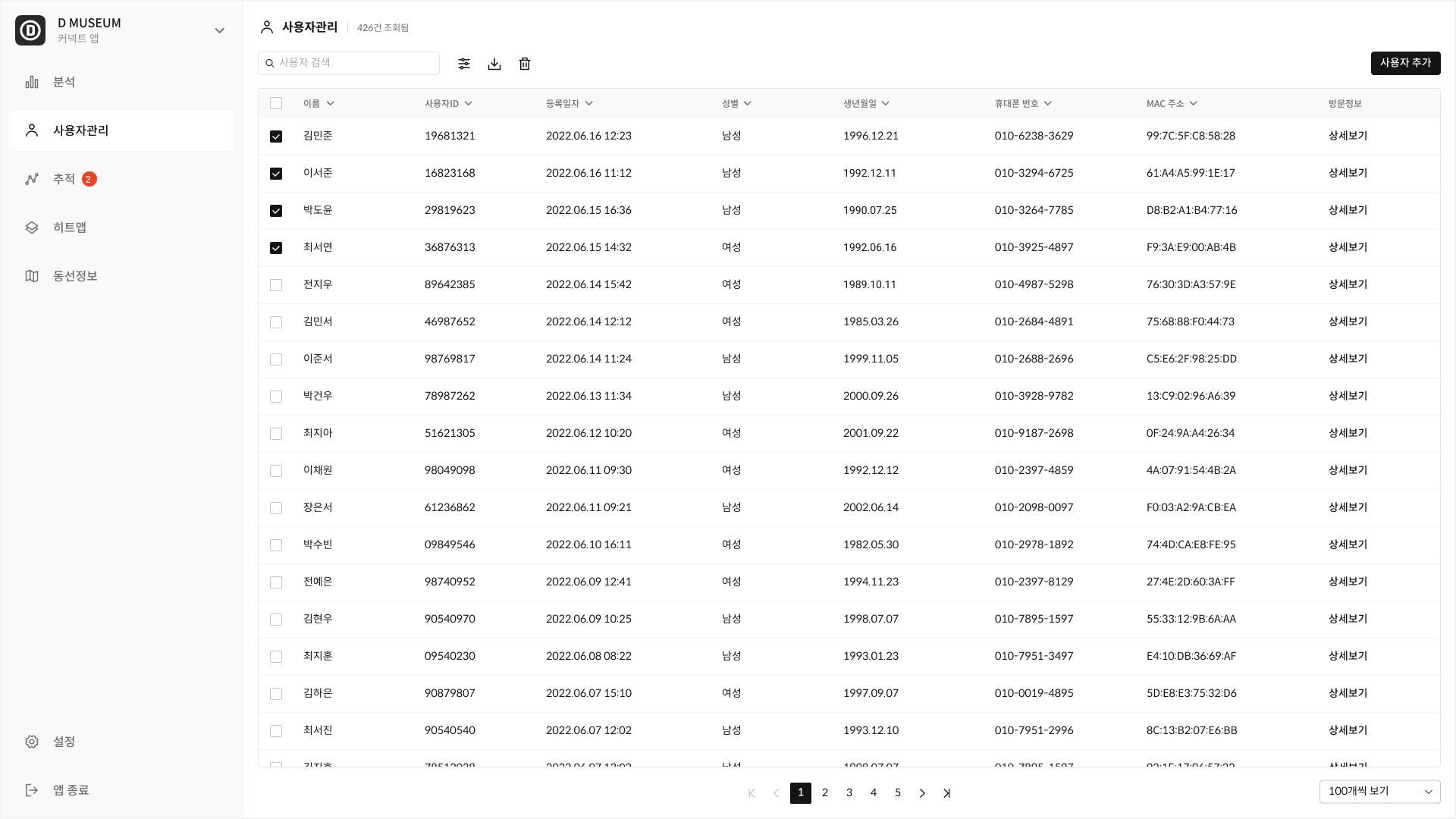
Screen Applying the Design System
