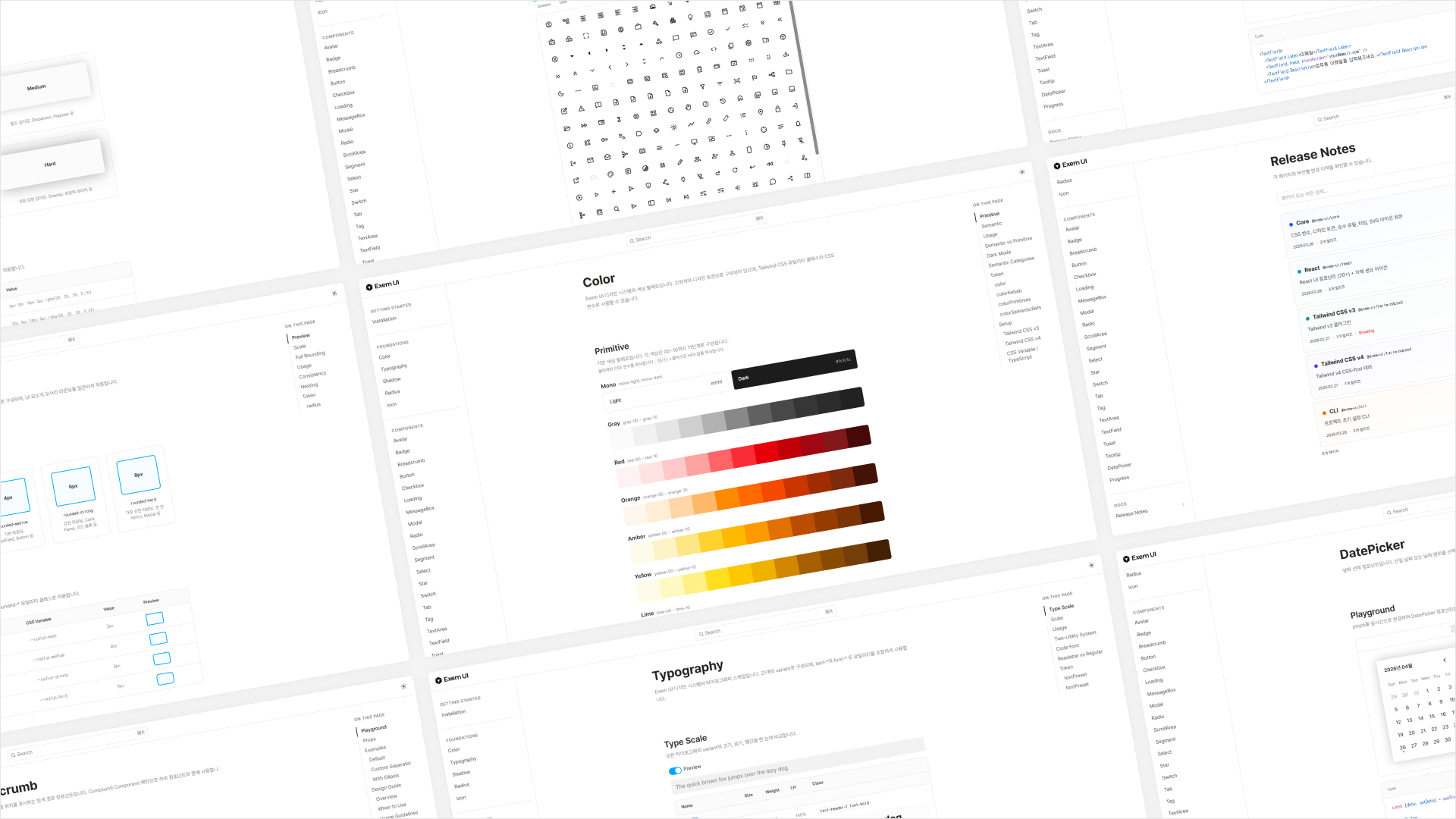
Exem UI Bringing products together with a shared design library
I built a shared library to bring a consistent experience to EXEM’s products. Aligning the structure of design components with code gave designers and engineers a common foundation to work from.
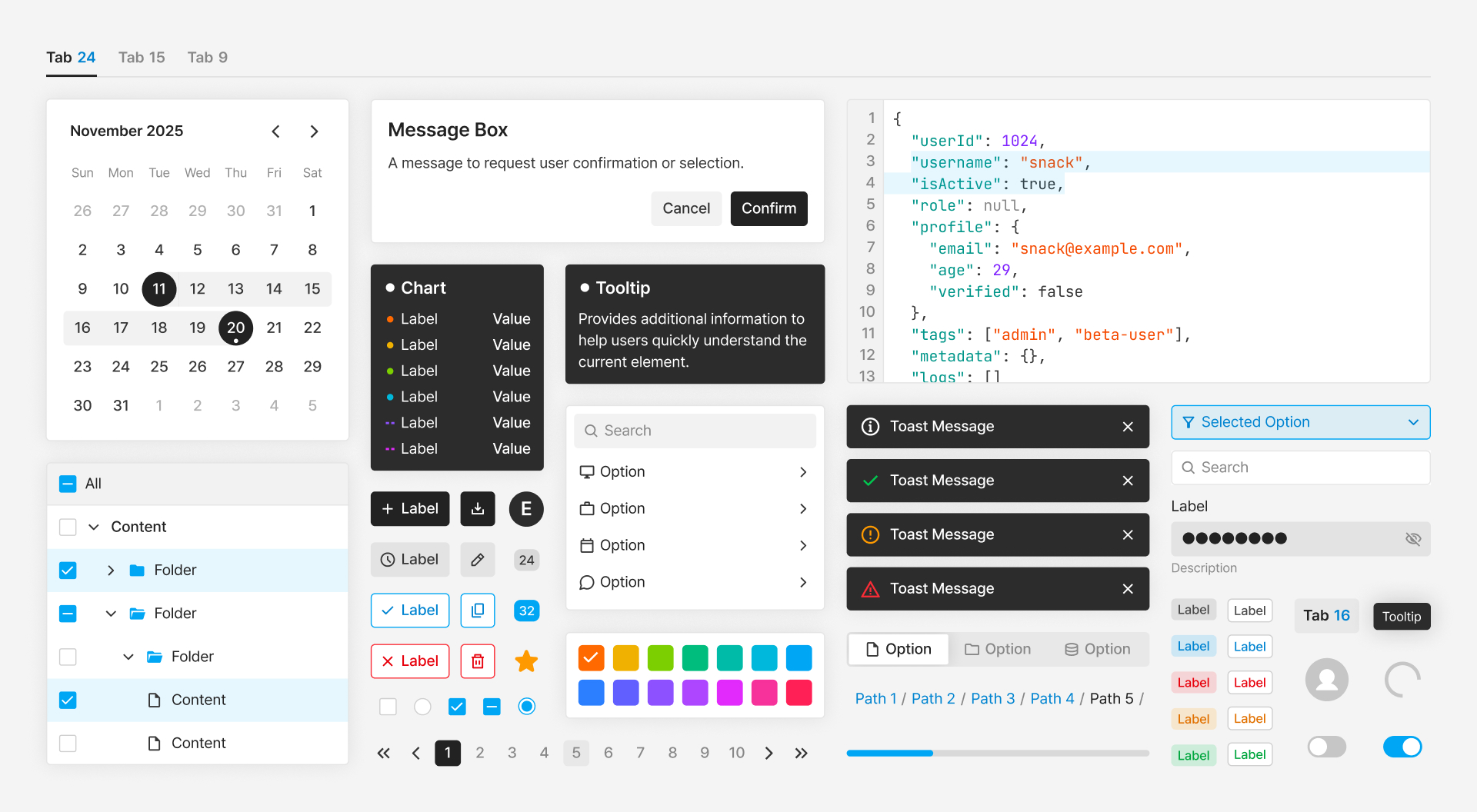
A common foundation across products
Each product had its own layouts and component conventions, making the experience inconsistent and maintenance more costly. We needed shared standards that could hold up as the products grew.
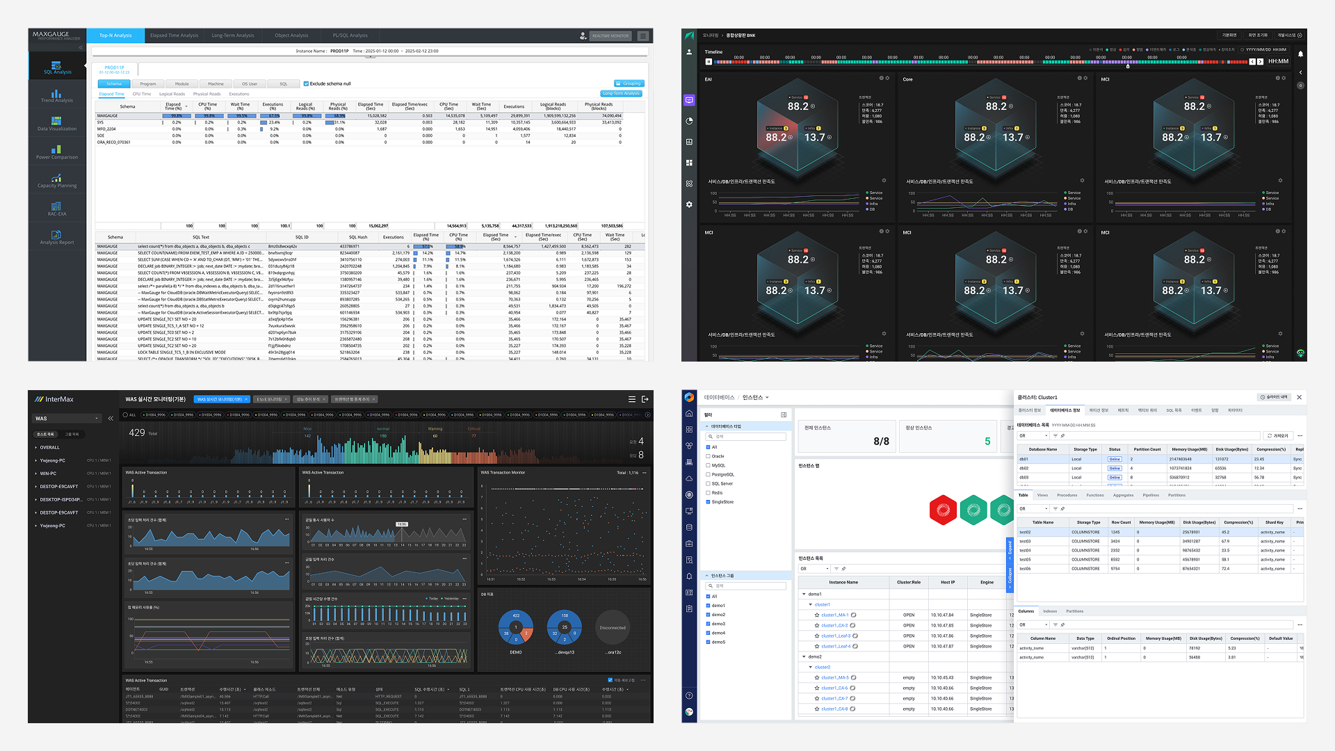
Built for the production stack
I worked with each engineering team to align the library with how their products were built, including React and Tailwind. The system needed to work in production as well as in design files.
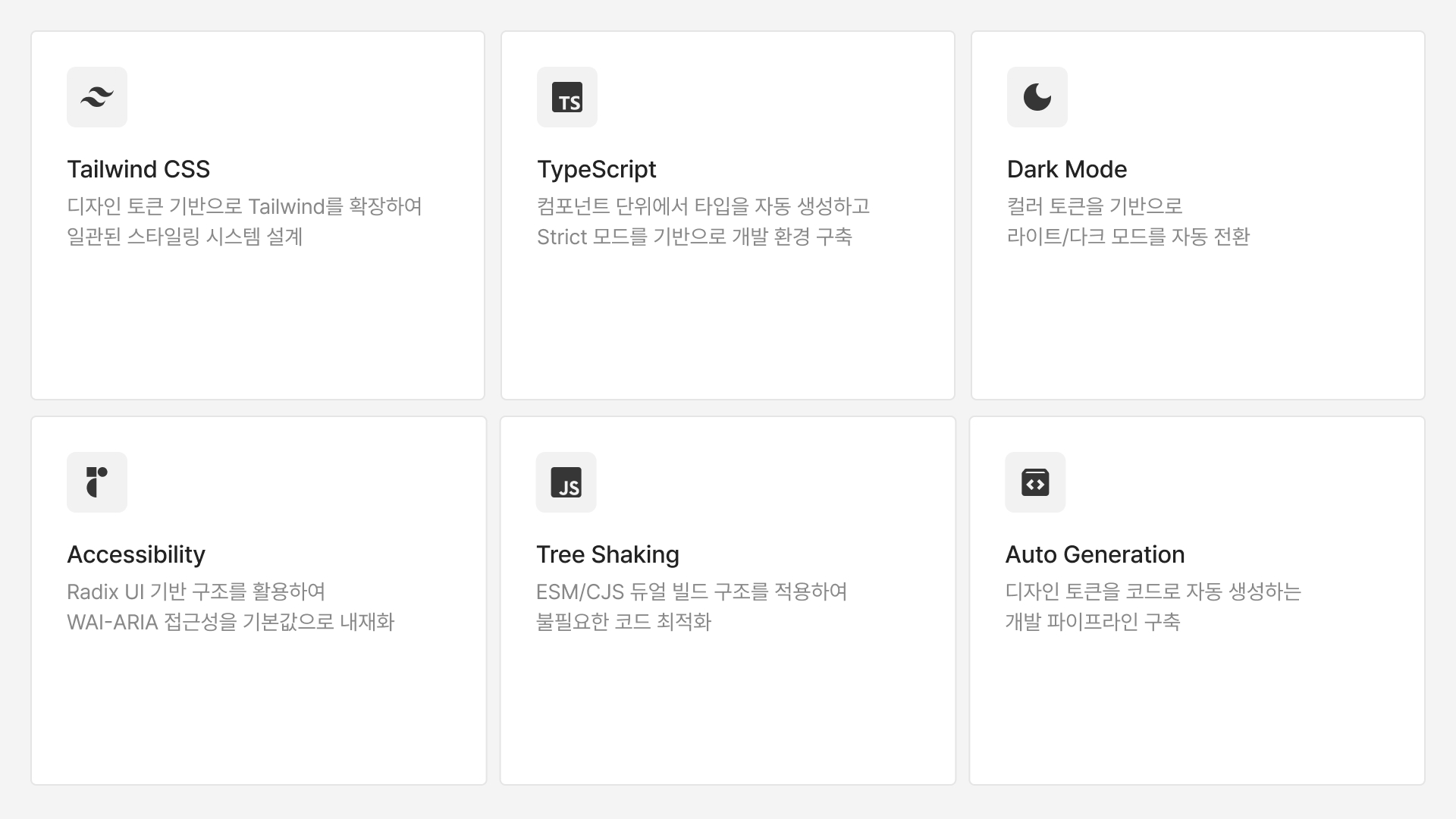
A shared language for design and code
I defined component props, variable names, and states with engineers so the design library and code followed the same structure.
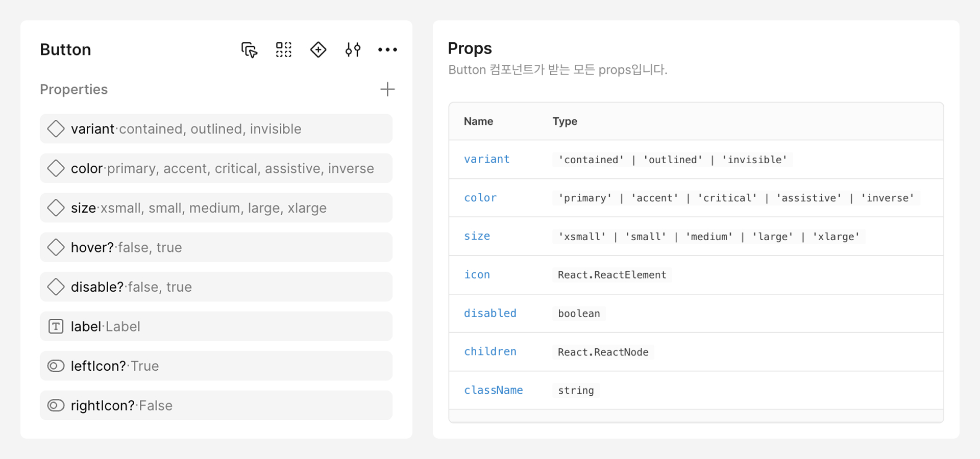
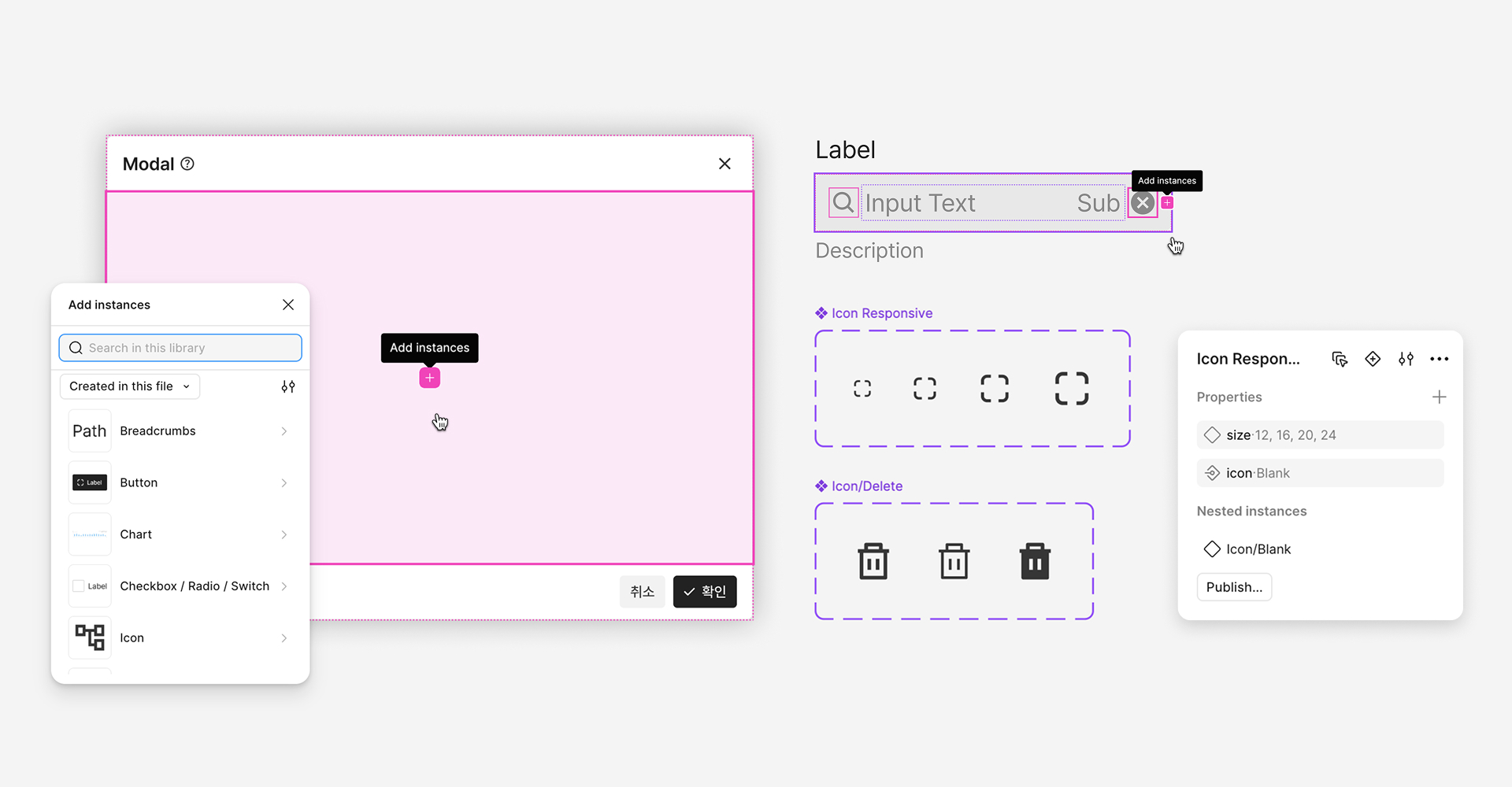
Flexible components, fewer moving parts
Nested instances, instance swaps, and slots let designers build for different contexts with fewer components while keeping screens consistent.
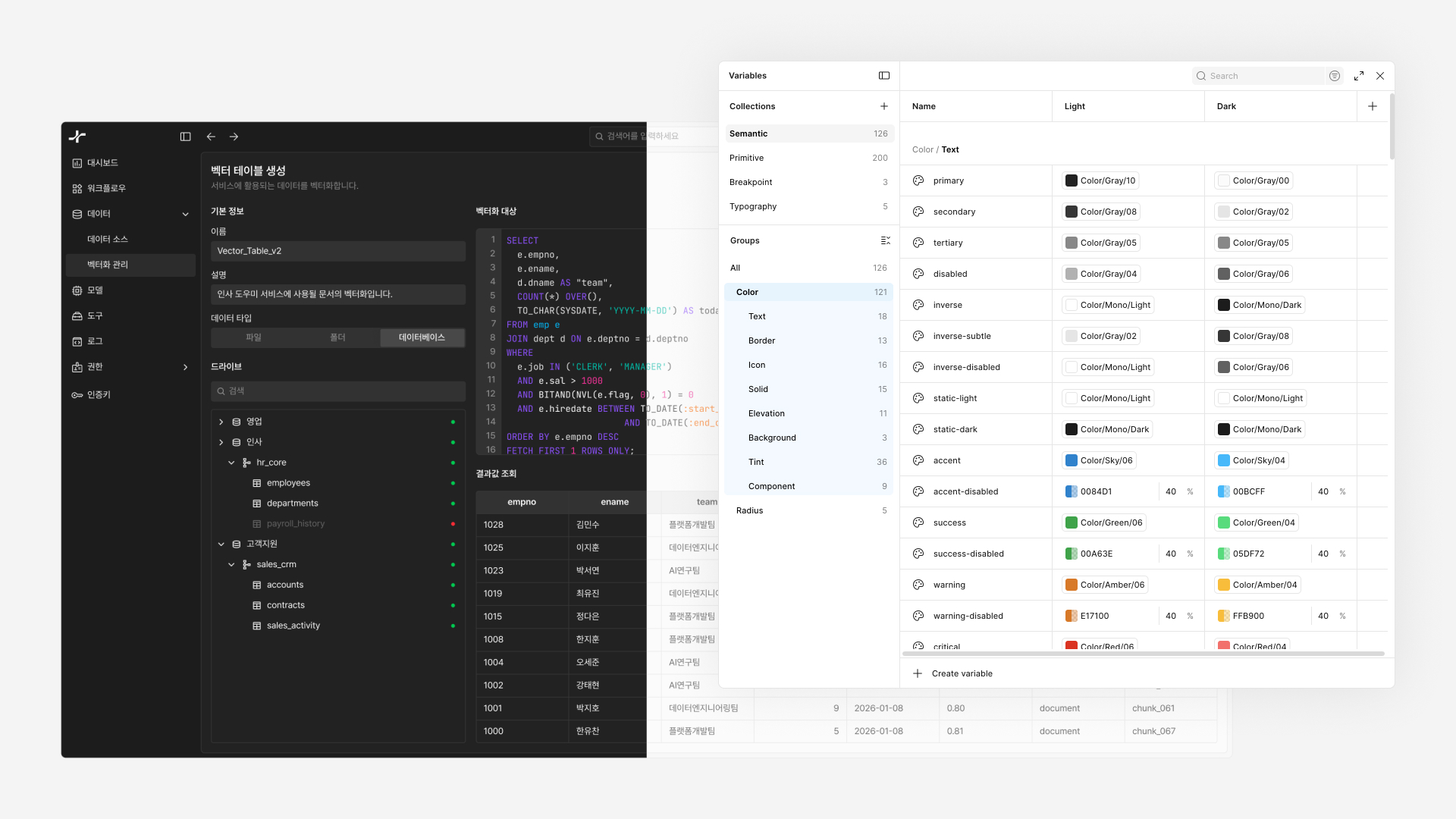
Light and dark themes from shared tokens
Semantic color tokens and Figma variables support both themes. Opacity-based elevation gives layers a consistent visual hierarchy.
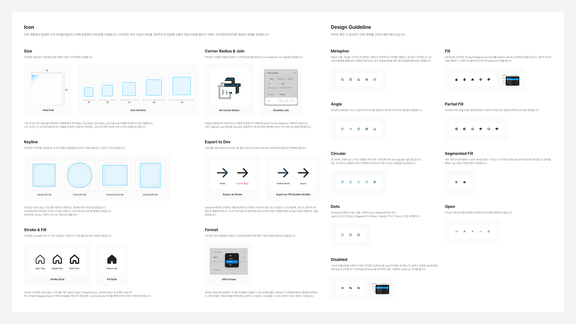
Clear guidelines for contributors
I documented shared criteria so new designers and teams across products could contribute to the system consistently.
One place for library documentation
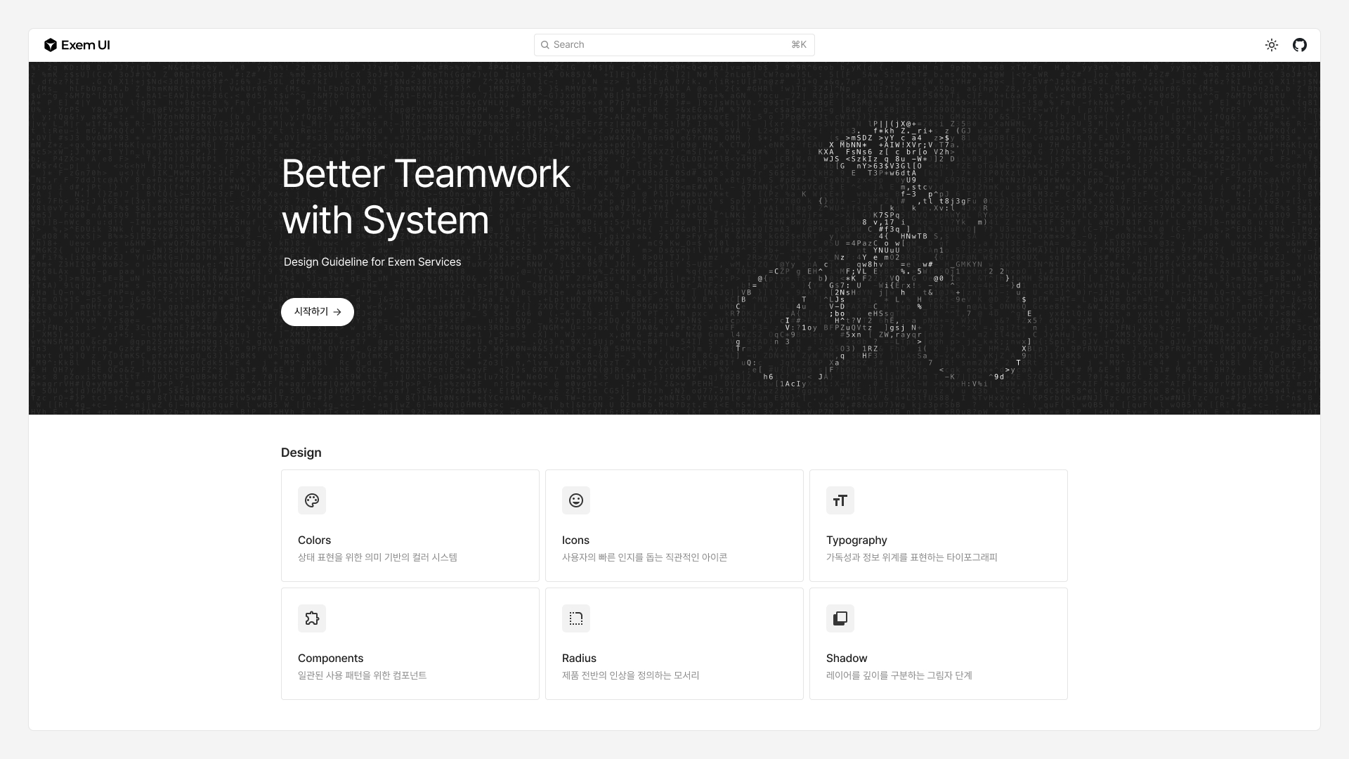
I built the Exem UI documentation site to bring design components, code, usage guidance, and release history into one place.
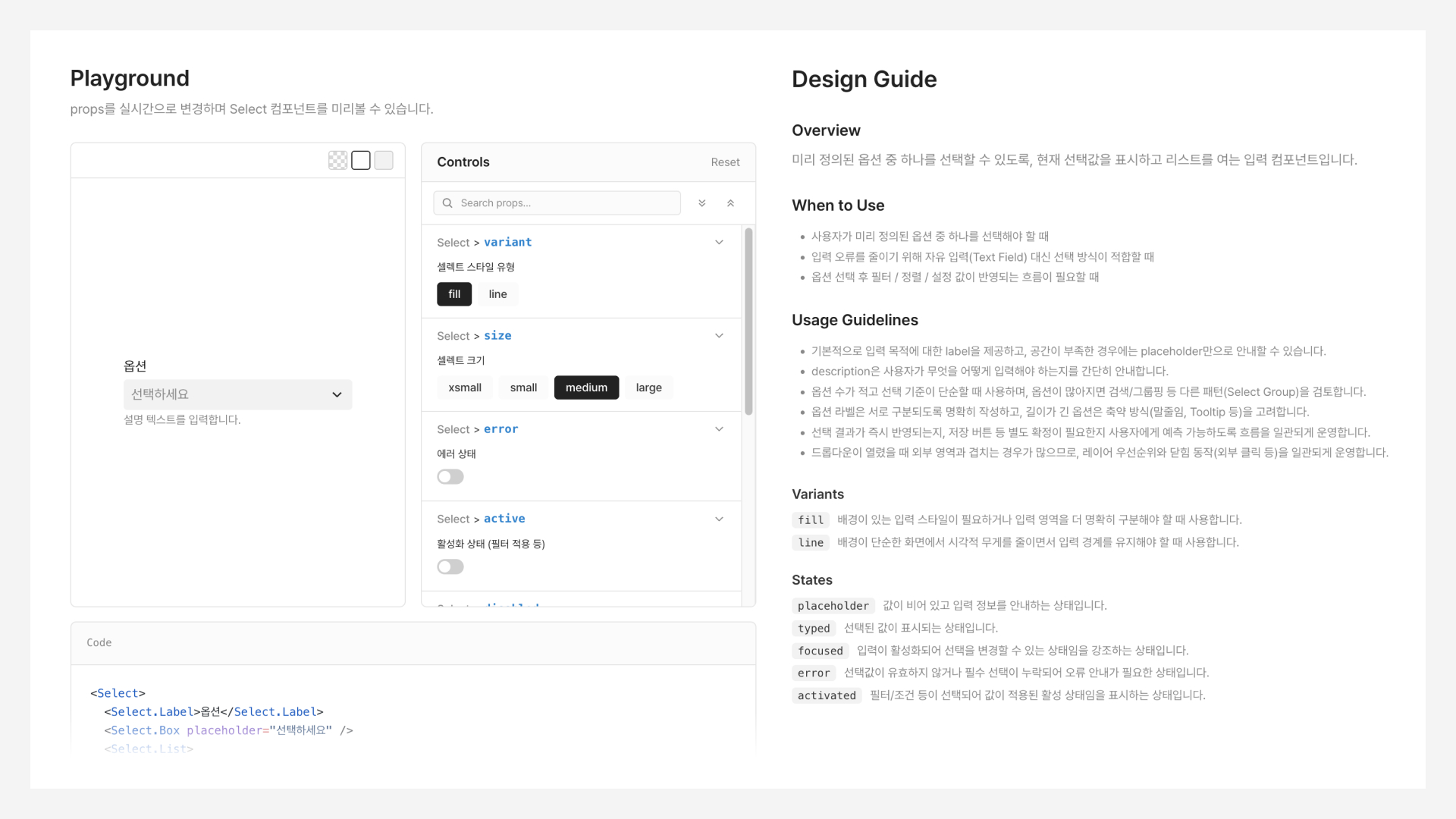
Explore how components work
An interactive playground lets teams change props and states to see how components behave. Usage guides explain where and how to use them.
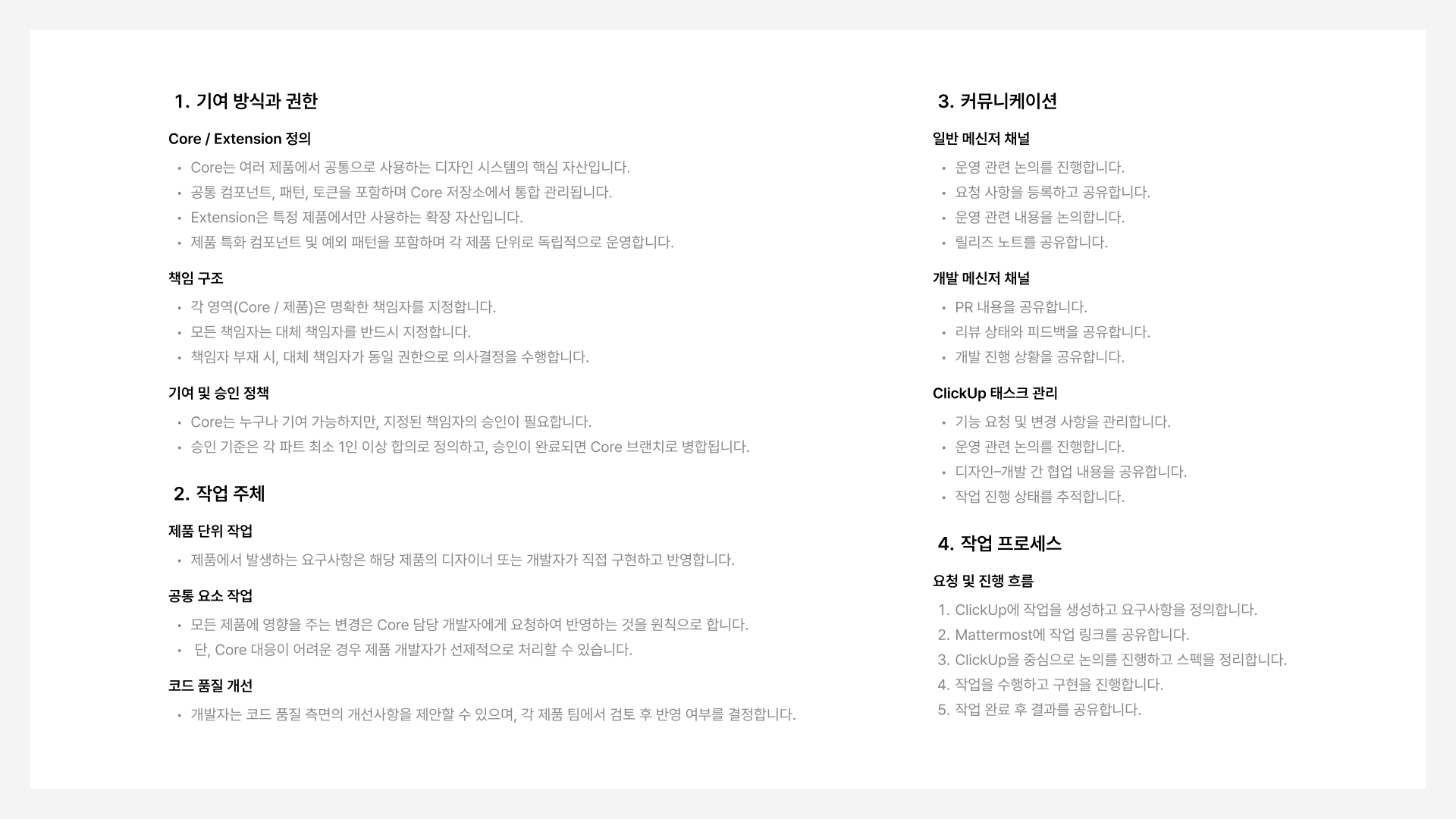
A system teams can keep improving
I defined ownership, permissions, communication, and contribution workflows so the system could evolve without depending on one person.
Making the library usable by AI tools
CLI installation and linked design guidelines give LLM tools the context to use the library, extending the same design language to internal tools and documentation.
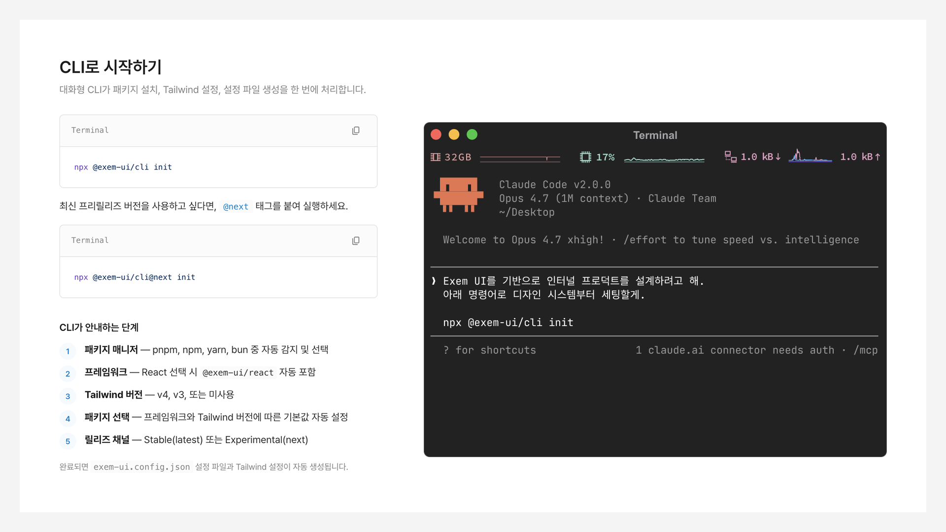
From idea to internal product in three weeks
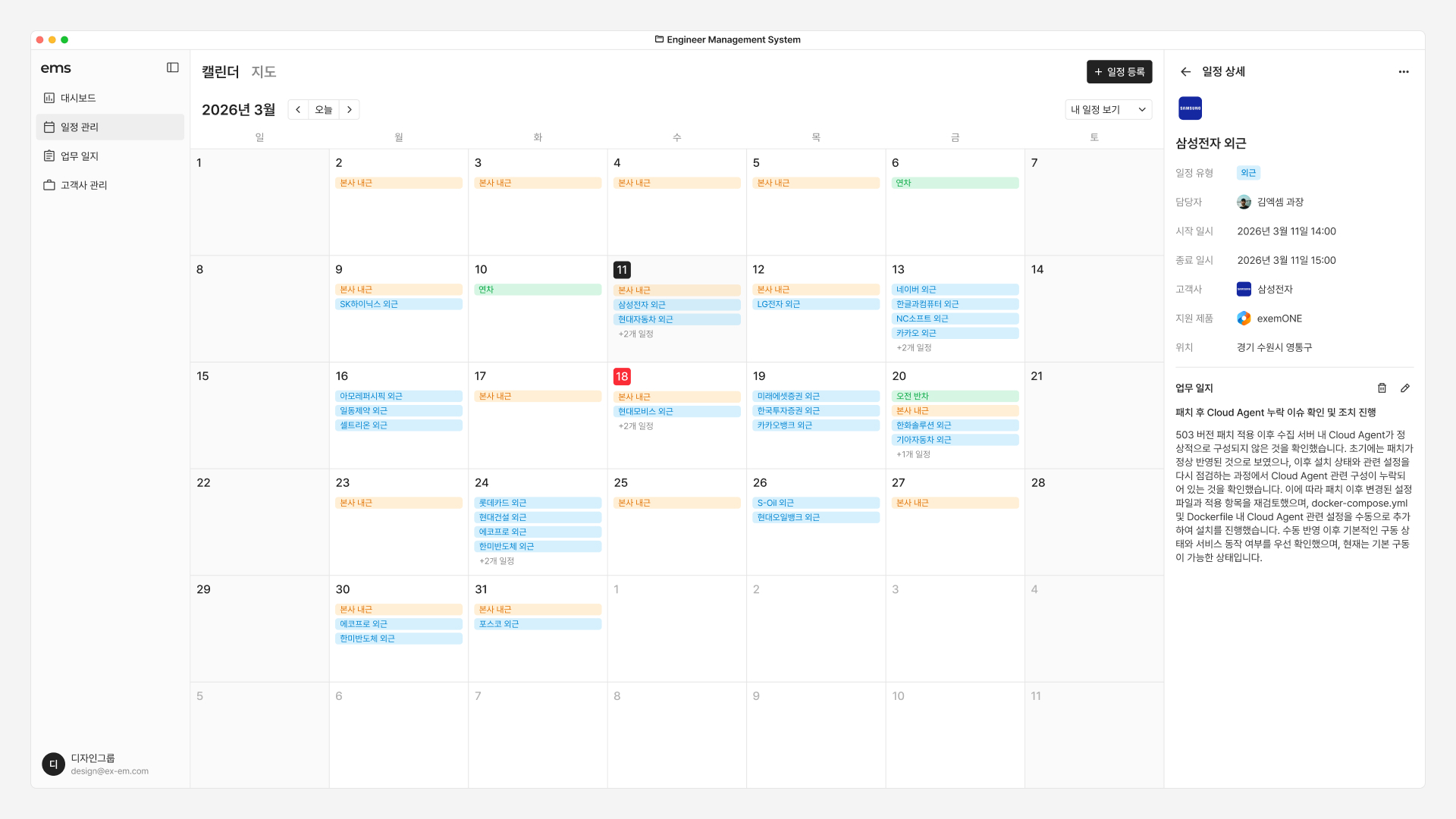
Using Exem UI and its guidelines with Claude Code, I took an internal product through planning, design, and development in three weeks, putting the library to a practical test.
Improving how teams work together
I aligned teams with different priorities around shared standards. The work extended beyond individual screens to address recurring inefficiencies across the organization.