Orbro Building a design system from principles to patterns
I built a design system for Orbro, a digital twin platform spanning multiple products and third-party plugins. The goal was to make the experience consistent and help teams work together more efficiently.
A shared foundation for a growing platform
With multiple products and external contributors, teams needed common guidelines to create a consistent experience.
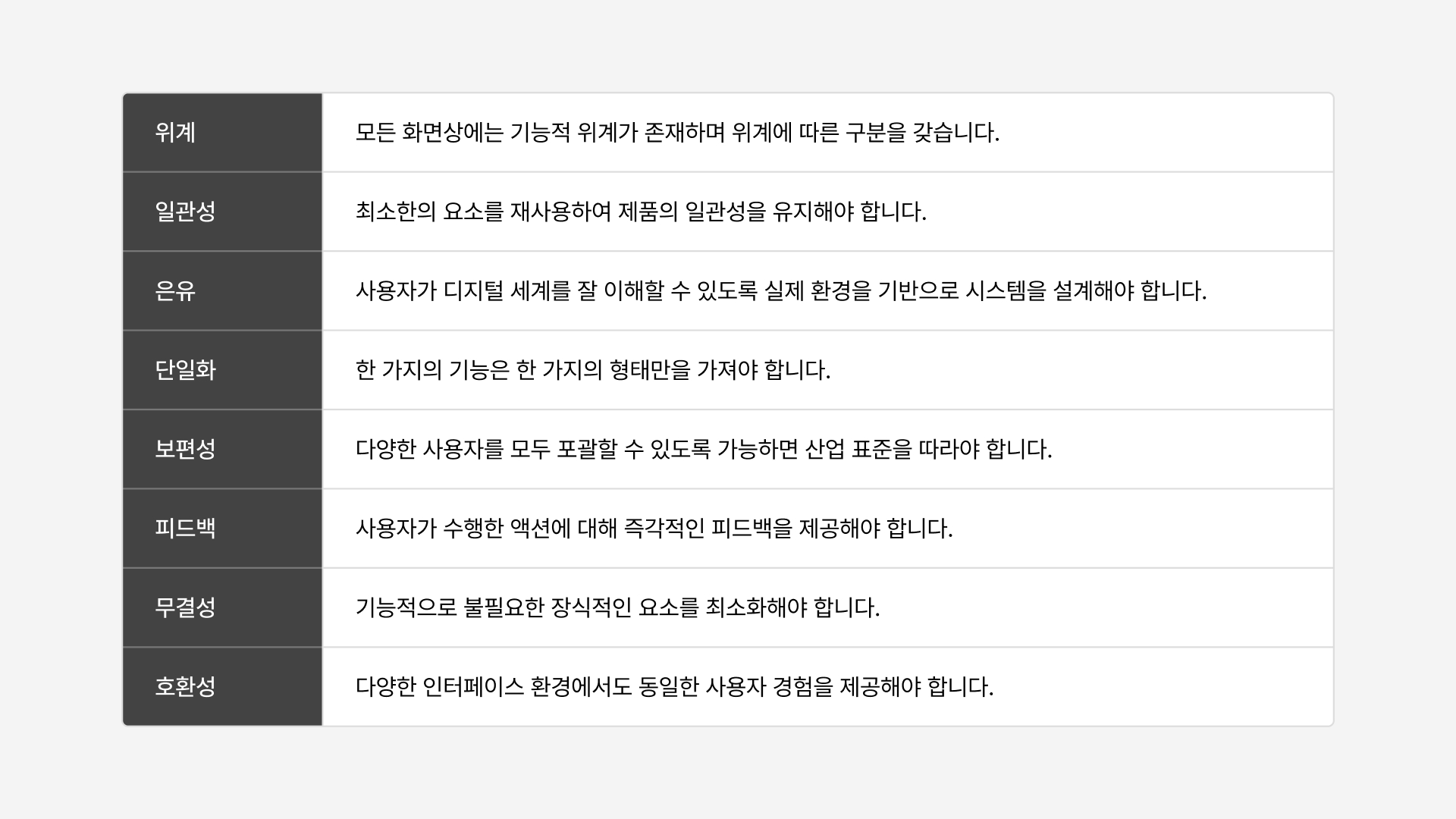
Principles that guide design decisions
I defined principles around Orbro’s product context, giving the team a shared basis for design decisions and a clear expression of its design philosophy.
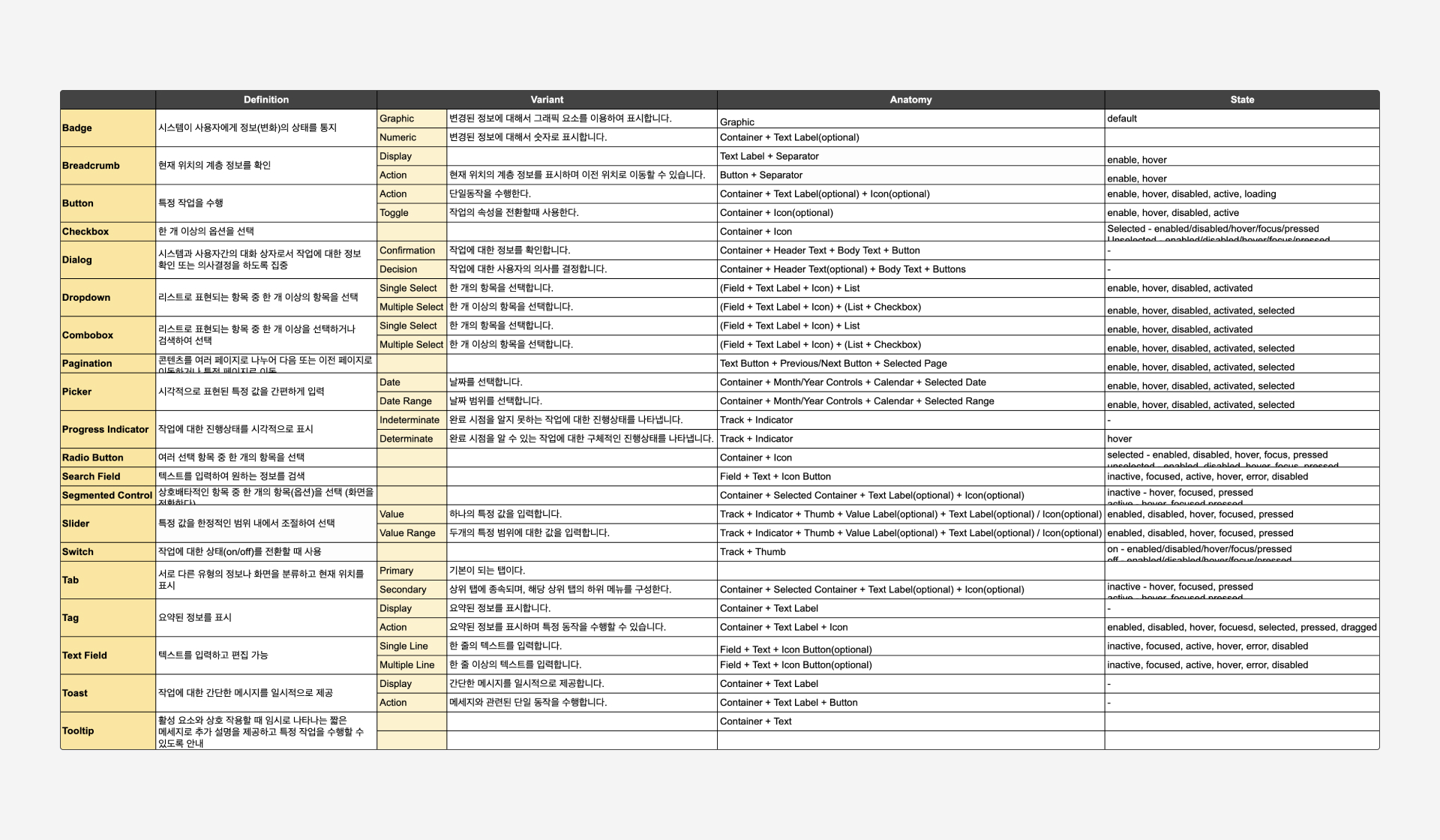
Defining what each component does
I identified reusable components and defined their anatomy, variants, and states to make their roles clear.
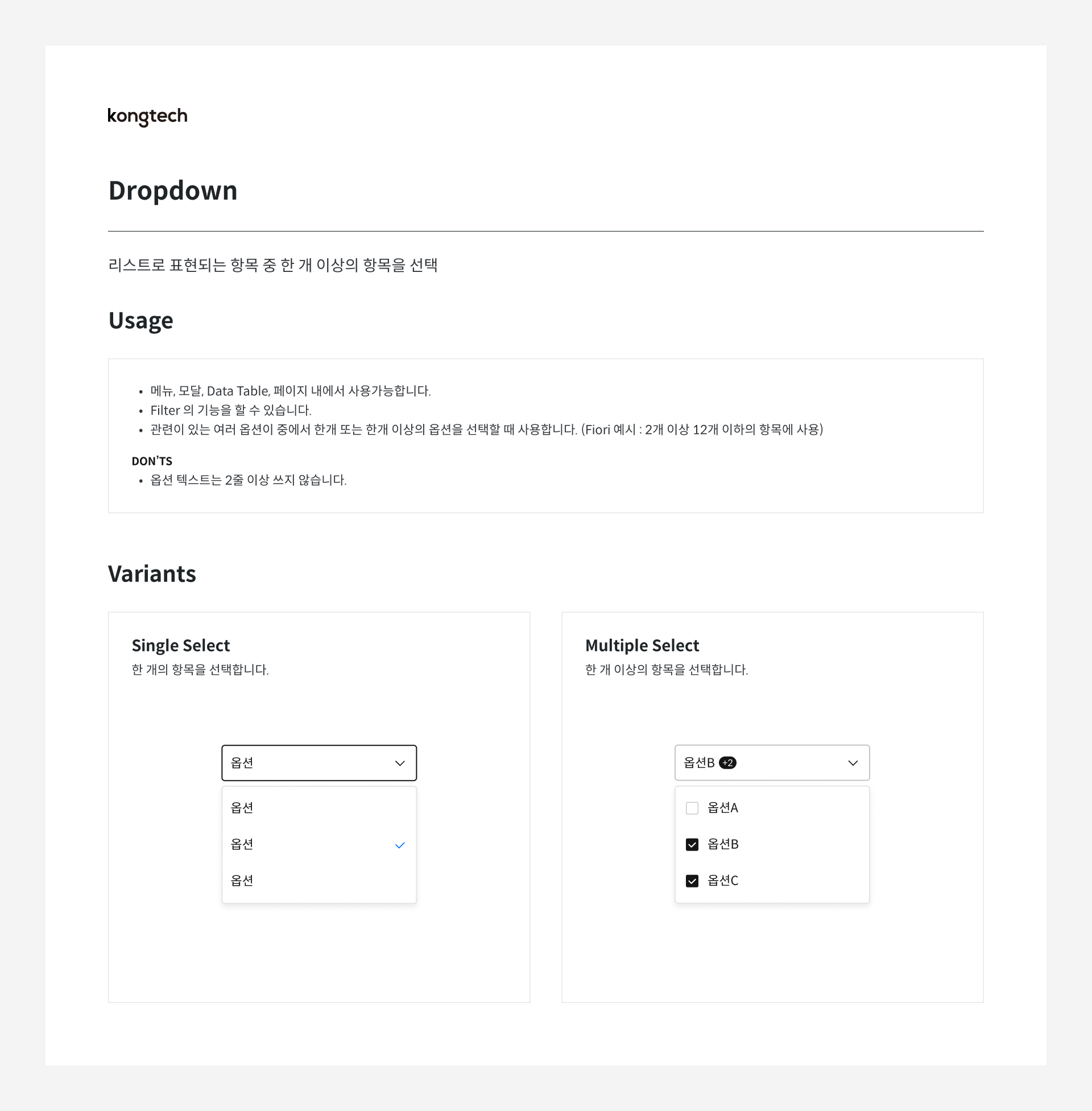
Guidance on choosing the right component
I documented each component’s purpose, variants, and usage considerations so teams could make consistent choices in similar situations.
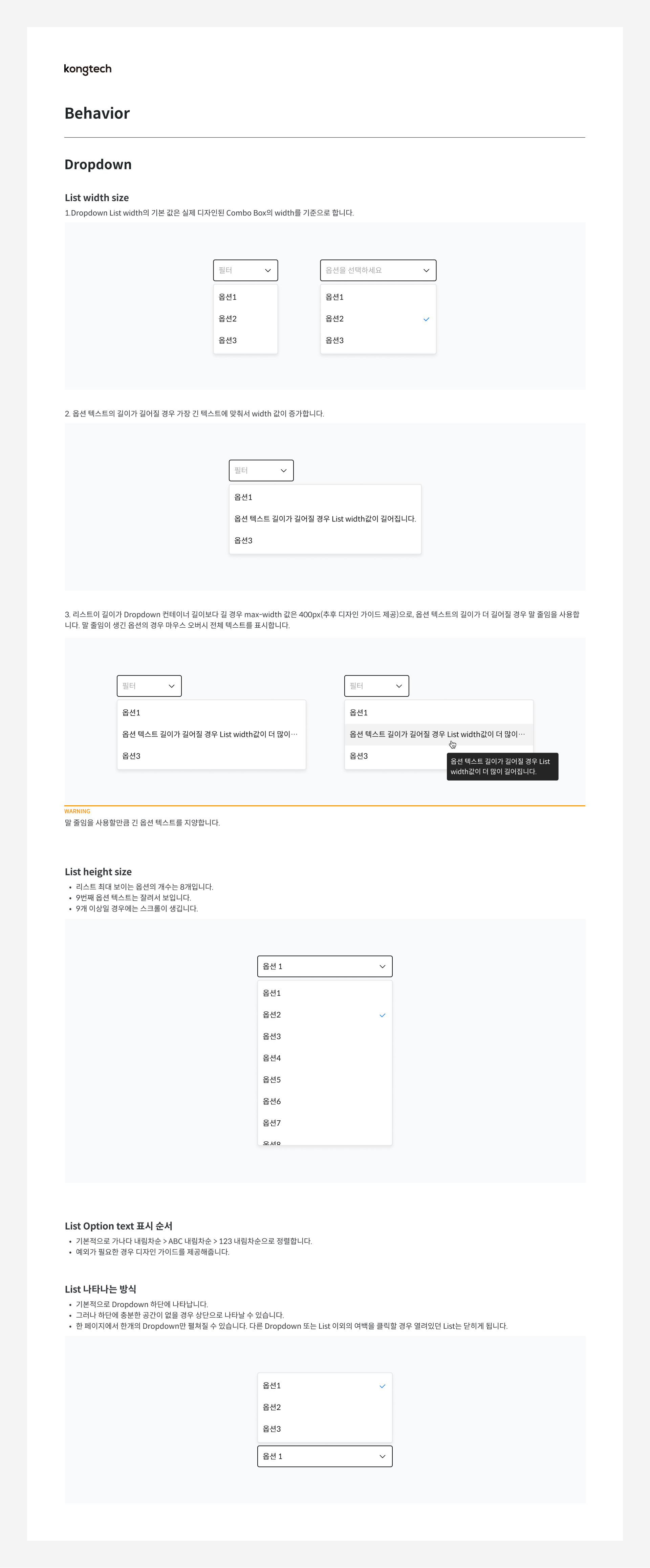
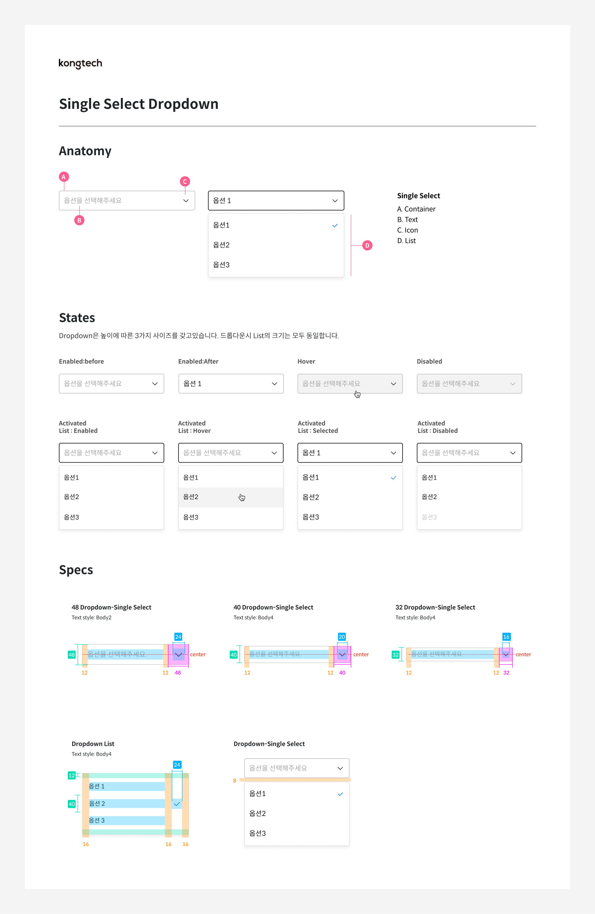
Consistent details across components
I standardized component structure, appearance, and states to make the interface more consistent and implementation more efficient.
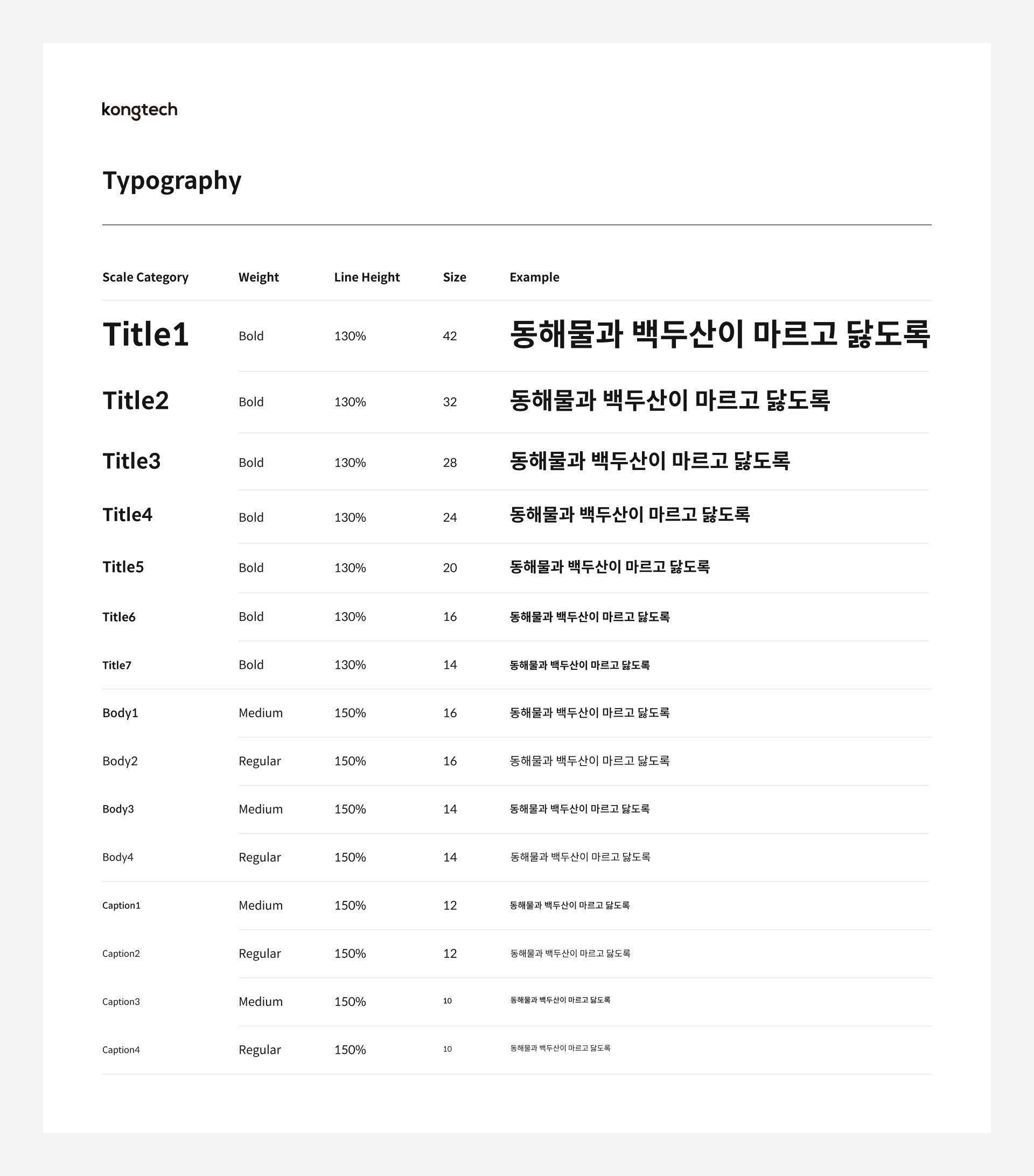
Typography for data-heavy screens
I brought platform-specific fonts into a shared type system to improve readability and keep layouts stable across data-heavy screens.
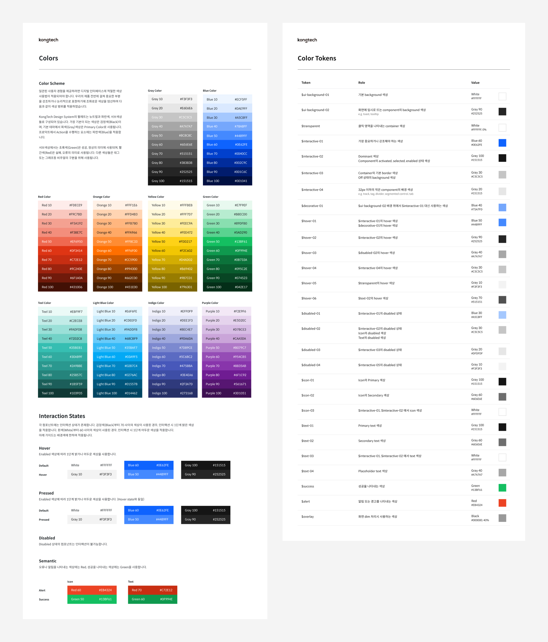
Color with a clear purpose
I organized product colors into tonal palettes and semantic tokens that describe how each color should be used.
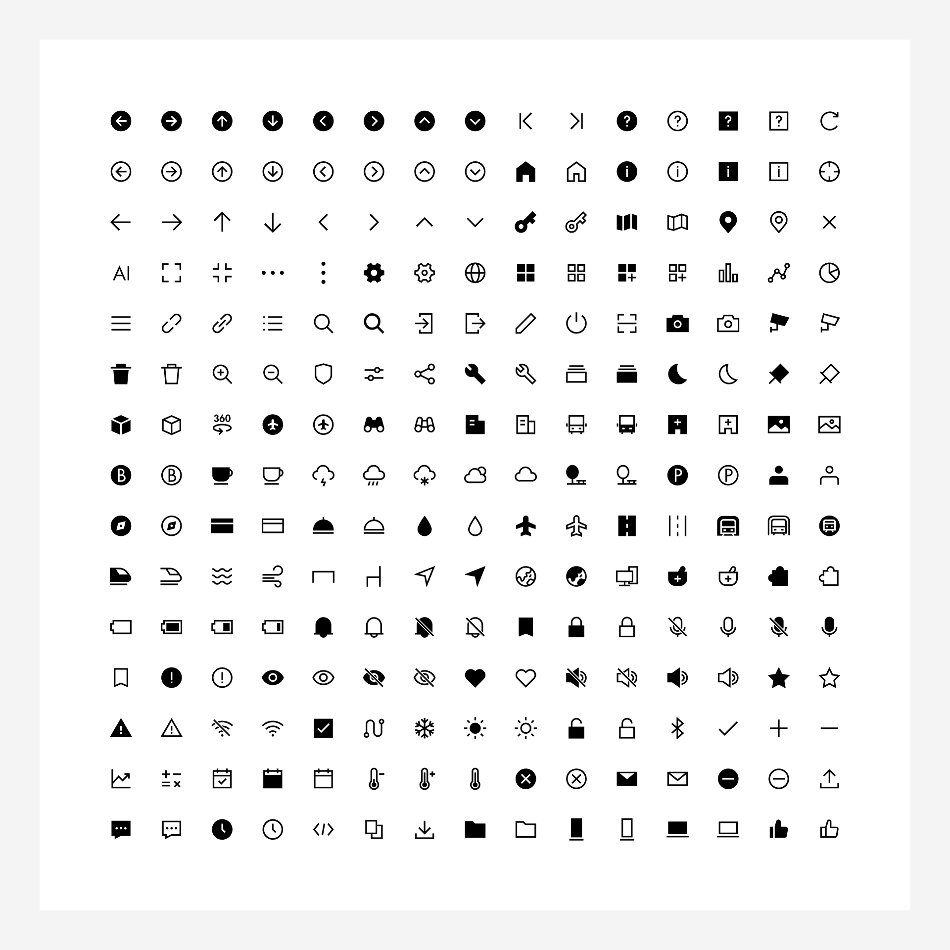
An icon system with brand character
I worked with a brand designer on five icon categories that balance clear communication with Orbro’s visual identity.
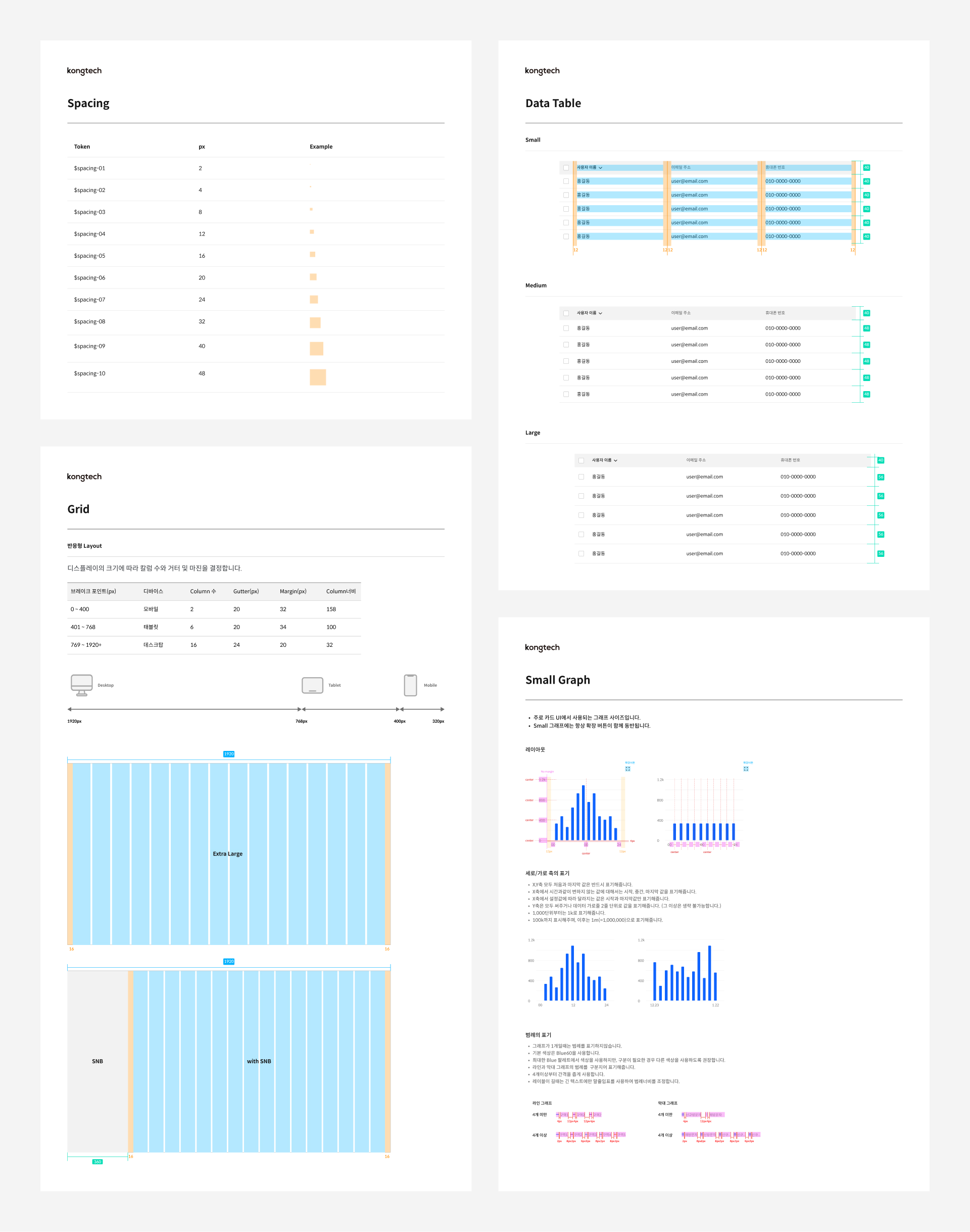
Responsive layouts for complex data
A 4px base unit and a 16-column grid guide responsive layouts for cards, data tables, and charts.
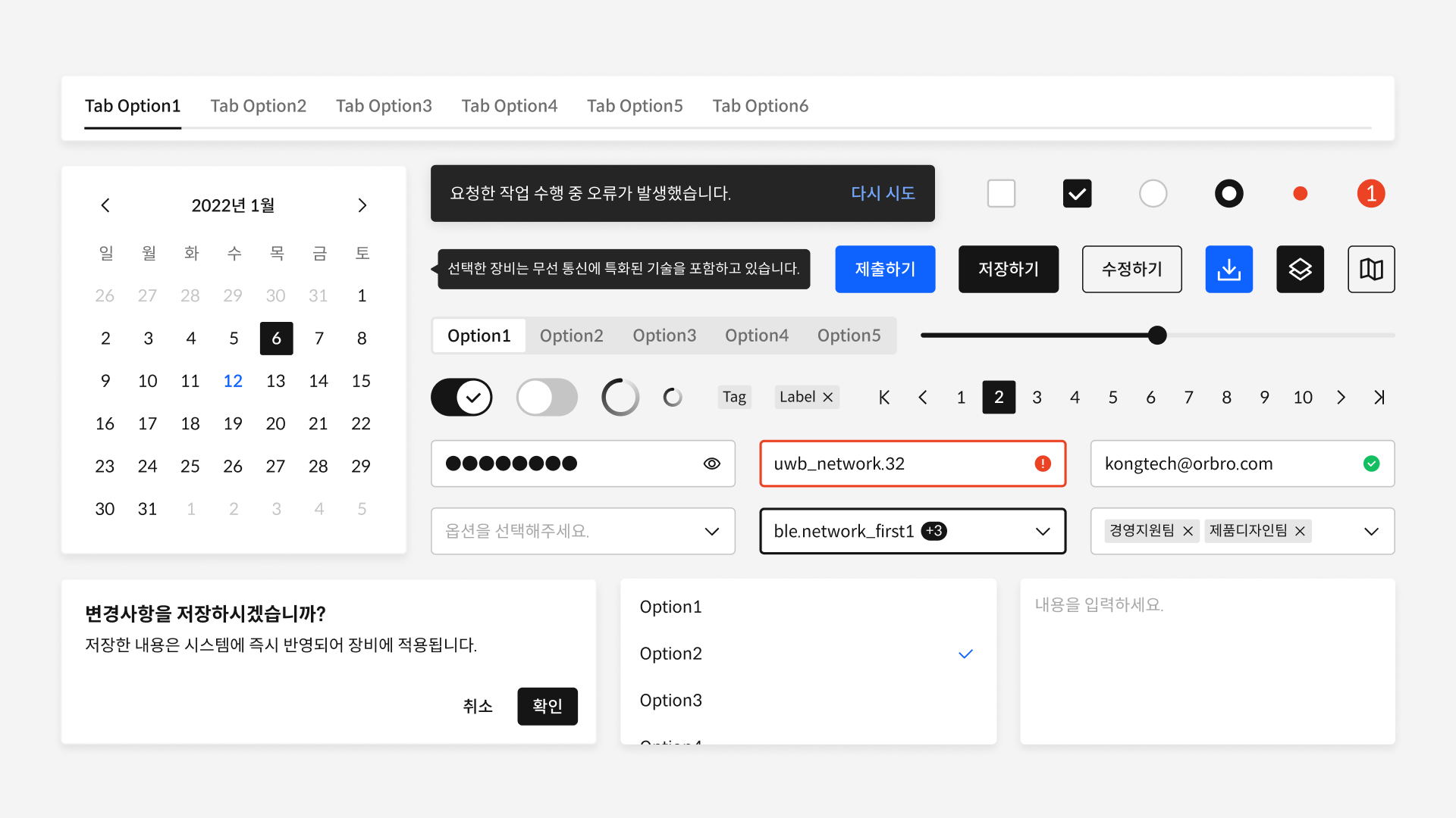
Reusable assets in Figma
I organized components, typography, colors, and icons into a Figma library to reduce repetitive design work.
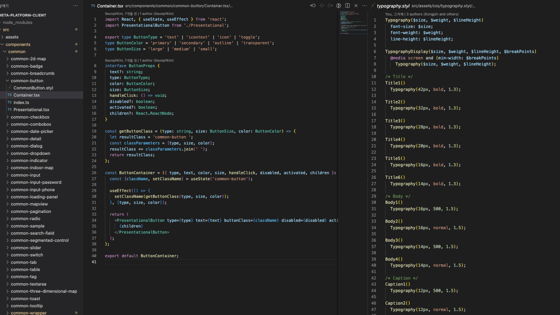
Bringing the system into code
I shared the documentation and assets with engineers, who implemented them as a reusable code library to streamline development.
What I learned
Building the system deepened my understanding of how UI elements work in context. Shared standards helped the team resolve ambiguous decisions and avoid revisiting the same questions.